

This project was part of a short sprint where we had to move fast, validate our ideas and hit our goal. Based around the Test & Delivery framework, it started as a test project which was about informing rather than driving our decisions. The goal was to simplify the navigation. We believed that by showing users less, they would better understand the site and help us boost conversion rates.

Initial sketches working documenting animations and transitions. General notes about project.
UX Challenges —
On mobile, the navigation made it unclear whether Thread was a shop or simply a hub for inspiration. We frequently heard some users commenting they were unaware they could make a purchase, which was clear from past user testing sessions. Moving around the site wasn’t intuitive and didn’t allow the user to achieve their goal.
We were tasked with creating navigation that highlighted key areas of the site while still enabling users to access other features. We wanted to create a simpler experience for new users while not harming how existing users interacted with the site.

Previous Iterations of mobile navigation. Left to right- Original side scrolling navigation with box icon. Four tabbed iteration with liked items and cart icon, search removed. Expanded View. Three tabbed Iteration.
UX Solutions —
To solve these challenges, we created a simplified version of the existing navigation. This included hiding secondary content behind a ‘more’ tab, to maintain focus on the primary experience, and using established icons alongside typography to make Thread’s purpose clear.
Showing side tray navigation, search and scroll animation.
Addressing the issue of Thread not being recognised as a destination for purchase, we changed the box icon for the checkout into a bag icon, which is more widely recognised across competitors. As a result, we saw a 2% relative uplift in conversion rates.

Icons. Left to right- Old Box Icon. New Bag Icon. Bag Full Icon.
We believed making ‘liked’ items more prominent on the navigation would help increase conversion rates and repeat purchases. This change proved positive for new and existing users.
One issue we encountered while testing the first iteration was that highlighting the core features increased messaging to stylists by 150%, which we simply couldn’t support at the current growth rate. After running this test for a month, we decided to run another test without ‘messaging’ in the navigation to explore if this would affect conversion rates. This change proved positive, resolving the issue without affecting conversion.

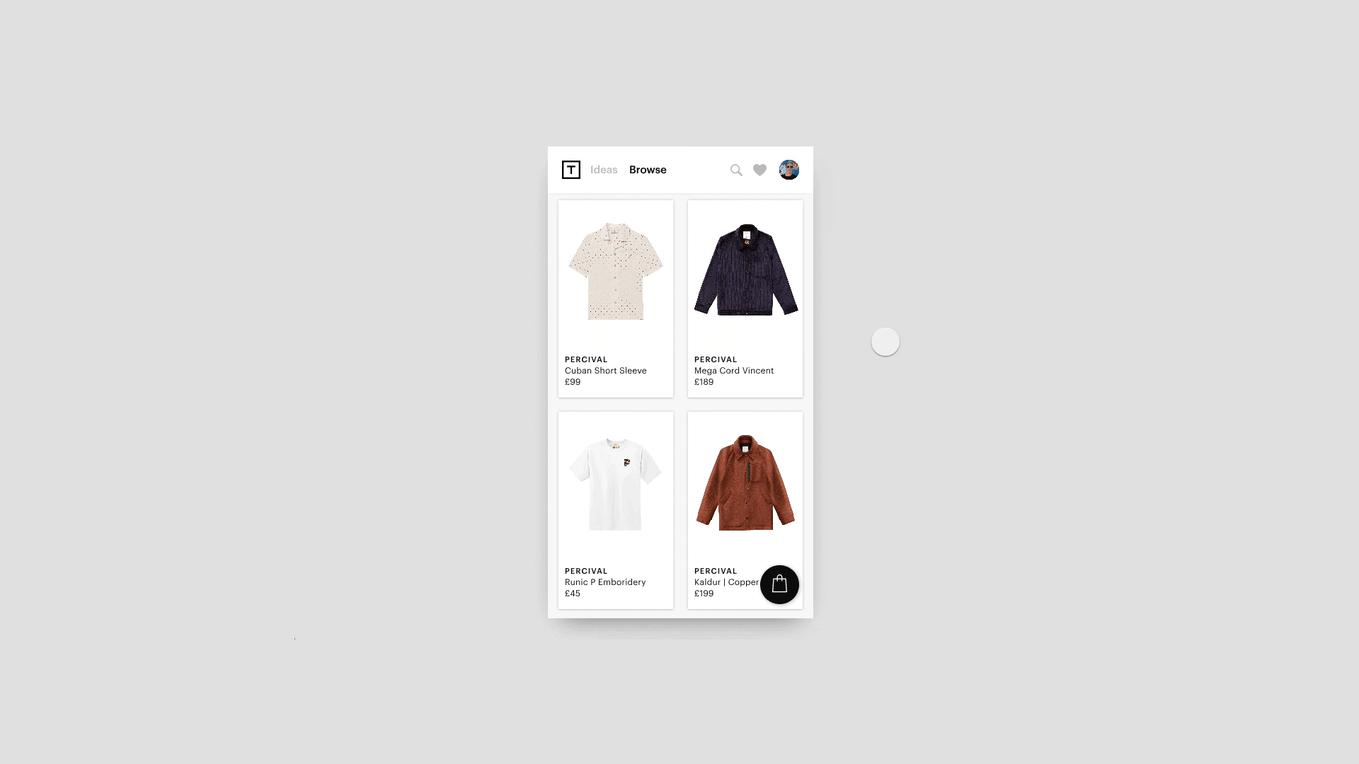
Simplified navigation user interface. Left to Right. Browse and products. Search bar. Side tray navigation. Product page. Expanded product page and add to cart.
In the final concept, we also highlighted the cash incentive for referring friends, which is an important driver for new business, and made the checkout icon consistently visible on-screen, to constantly remind users they can purchase.
These updates all improved the user experience and helped elevate growth.

Showing product view transitions and added to cart.